
Featuring A Common Place Park Poster from URevolution.
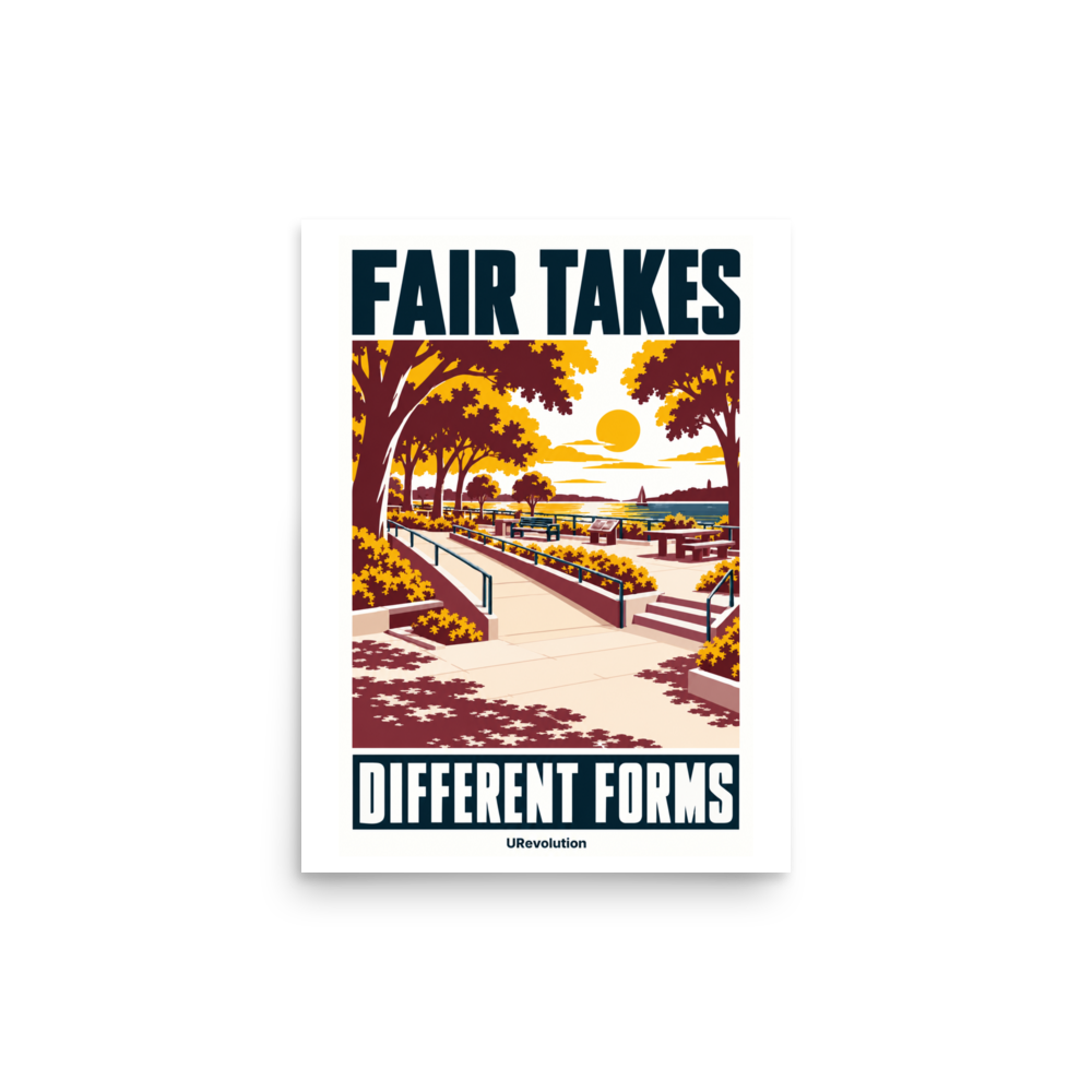
Two routes lead towards the water. One takes the stairs. The other follows a gently rising, step-free path beside the planting. Ahead, a terrace offers somewhere to sit, with autumn trees framing the view.
This is the imagined setting of URevolution’s A Common Place Park poster. Above the scene are the words “Fair Takes”; below it, “Different Forms”. Between them sits a practical question: what makes a place genuinely public if some people cannot comfortably use it?
Calling somewhere public tells us very little about who can spend an afternoon there. That depends on decisions about the ground beneath our feet, the distance between seats, and the routes available when stairs will not work.
The poster puts those decisions in the picture.
Getting there is the beginning
The two approaches make equity visible. People can share a destination while needing different ways to reach it. Equal worth does not require identical provision.
There is a temptation to stop at the path. Once a wheelchair can enter, the access question can appear settled. But an entrance leads somewhere, and what happens beyond it matters.
The US National Park Service makes a useful distinction in its explanation of Section 504 of the Rehabilitation Act: its responsibility extends beyond enabling entry to helping disabled visitors receive benefits comparable to those available to other visitors. It explicitly includes sensory and cognitive disabilities alongside mobility disabilities. [1]
That changes the question we ask of a park. Can people enjoy what they came for? Can they find their way, spend time with others, and stay long enough for the visit to be worthwhile?
For someone with limited energy, a seat can affect how far they can comfortably go. A place to rest can make staying possible. Neither need has to be visible to a stranger to deserve consideration.
In the illustration, seating belongs beside the paths and gardens. Rest has a place in public life.
The decisions belong in the design.
Real access requires more than a persuasive picture. In the United States, the Department of Justice’s overview of accessible recreation spaces points to the 2010 ADA Standards and requirements for particular facilities, including play areas and swimming pools. [2]
The American Public Works Association’s description of its park-accessibility training brings the discussion down to site design: routes connecting facilities, turning space, and connections from transit stops and public sidewalks. [3] A welcoming terrace means little if the journey from the street ends at an impassable barrier.
Where can someone sit down? Is there shade, or a quiet room away from the noise? Access Institute includes these everyday questions in its introduction to Australia’s Design for Everyone Guide 2026. It advises planning for them at the start, along with accessible paths and signs that help people find their way. [4]
These sources address different settings and legal frameworks. Together, they direct attention towards the choices made by the people planning and managing a place. The visitor should not have to compensate for every omission.
South Australia’s Inclusive Play guidelines, listed by Parks & Leisure Australia, extend that thinking to participation: finding the playspace, moving around it and reaching the play experiences themselves. They also ask whether the community has had a voice in key decisions. [5]
That last point matters. An illustration can express an intention. In a real project, disabled people need a say in deciding what works.
A park worth looking at
A Common Place is an imagined park, rather than a construction proposal or a verified example of compliance. Its job is to give an idea a setting we can recognize and want to spend time with.
The artwork draws on the public-space poster tradition associated with the WPA era. Bold lettering gives it presence at a distance. Closer up, deep ink-blue railings guide the eye through warm paving and planting towards the waterfront. Golden yellow and burgundy give the trees their autumn color.
The view matters. Access leads to somewhere desirable, with room to pause and enjoy being there. The step-free route is part of the composition, as ordinary as the gardens.
Disability equity gives the image its starting point. Its wider relevance follows naturally: shared environments work better when their designers allow for different ways of participating. That principle can travel into a workplace or community meeting without losing sight of the disabled people whose exclusion makes the issue urgent.
On a wall, the poster offers something to look at again. The words make the statement; the paths give the eye somewhere to follow as it considers it.
“A Common Place” names somewhere held in common. It also suggests an ambition for access to become commonplace: expected when decisions are made, with fewer people left negotiating whether they can take part.
There is water ahead. Everyone should have a way to enjoy the view.
From URevolution: A Common Place Park Poster
An imagined waterfront park gives visual form to “Fair Takes Different Forms”. Printed on softly textured 285 g/m² Fine Art Paper, in three sizes. View the poster, sizes and paper details.